How we helped overhaul the charity platform serving thousands in need


- Philanthropy
About the project
The client
Mite.org is a US-based public charity that collects donations for worthy causes worldwide. The foundation curates many impactful projects, each with a specific purpose and amount to be raised. Since they collect through their website, the founders wanted us to redesign and rework it to better serve the foundation’s goals and make it easier for both the sponsors and the Mite curators to help people.
Initially, Mite’s representative approached us with a request for a simple makeover. They felt their website back then looked outdated, with rough branding and not entirely clear messaging. But what we ultimately delivered was a full-fledged application with payment functionality, newsletters, user profiles, search, and more.

{{services-provided}}

{{tech}}
Client’s challenges
- 01 Redesigning the site to make it easier for sponsors to help people.
- 02 Attracting new sponsors to increase the number of donations.
- 03 Adding valuable content for users who are already participating so they understand how they help others in need.
- 04 Improving the presentation of information on the site so it meets modern standards.

Product scope
- Implementing a custom donation form with Stripe as a service provider and allowing to separate and monitor donations by projects.
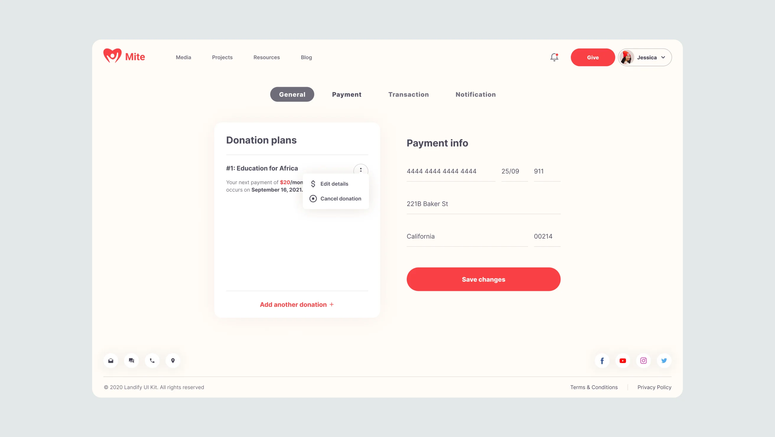
- Adding a dashboard and accounts page for registered users containing detailed information about the projects.
- Simplifying the donation process and implementing subscriptions so that regular supporters can approve recurring transfers instead of making one-time donations.
- Adding a dashboard and accounts page for registered users containing detailed information about the projects.
- Adding editable content sections for future publications.
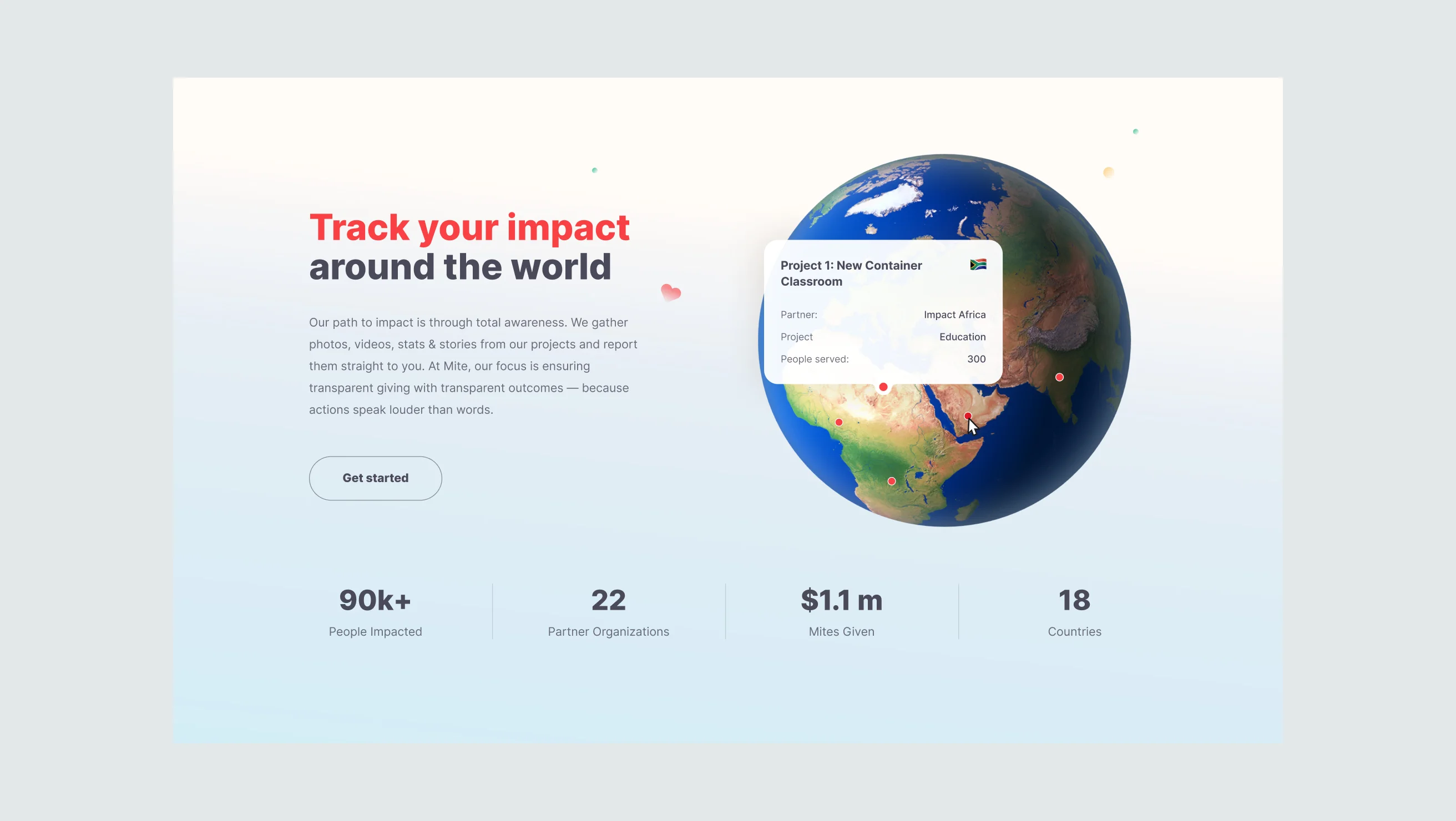
- Creating an animated 3D globe with markers of ongoing fundraisers.
- Improving the website’s structure to attract more sponsors to the cause.

Payment system
Custom donation form
The client chose Stripe as a payment system to process the donations. One of our main goals was to separate the projects so that the client could see and analyze the numbers for each of them individually. And so, we’ve skillfully used Stripe’s online store product management functionality to enable the collection of donations on a per-project basis, where each project is seen as a product.
In doing so, we’ve also implemented a handy option of subscribing to charitable projects, allowing donors and sponsors to commit recurring transfers for the amount and within the timeframes they choose. Once subscribed, the donations will be charged from their cards automatically, i.e., weekly, monthly, or annually.

Profiles
User space
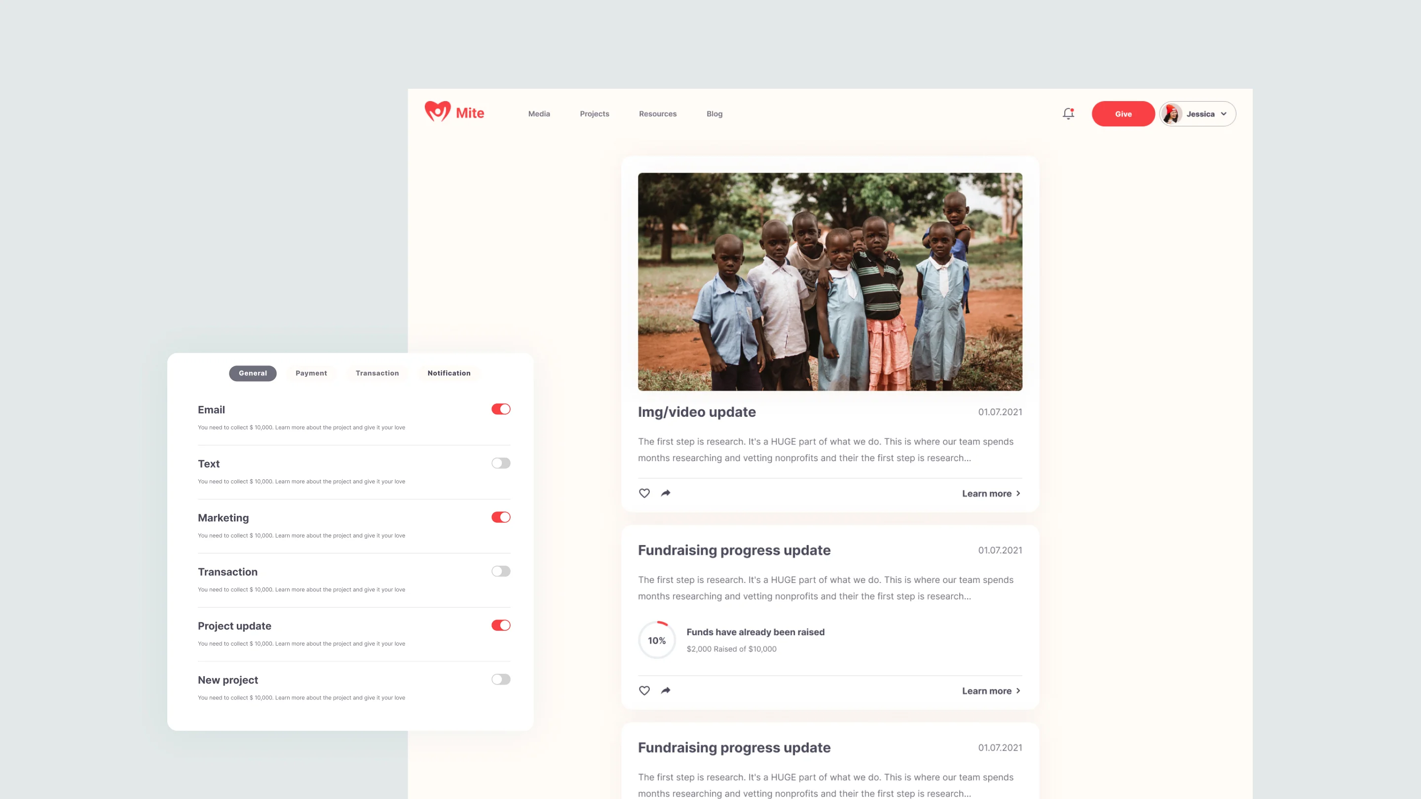
We’ve designed a clean and functional dashboard in the user profile area where users can choose a specific curated project, select a subscription period, see all the other projects they’ve subscribed to, and view the donation sums raised. This section also includes a photo gallery that users can like and share on social networks.
Having implemented the registration function, we had to decide where to store user data. This could be done either through the Auth0 service or directly in Sanity CMS. Because much of the application data associated with users was already stored in CMS, we chose to stick with Sanity once again. As per the client’s request, we’ve made this area functional, colorful, and informative.

Documents
Data handling
As mentioned above, we use Sanity not only to manage static content but rather as a full-fledged database with data being regularly added, edited, and deleted. Using it to store the data of registered users allows the site owner to see their contacts and assist them with any account-related problems when necessary.
Creating this schema with the user data in Sanity was a great solution as it’s connected to other various documents, such as project subscriptions or news, links to the liked posts and images, etc. This approach enables a more convenient work with documents and their connections.

3D visualization
Three.js Globe
Another interesting feature we’ve implemented at the client’s behest is a 3D globe visualizing all the organization’s projects. We’ve added a geolocation list in Sanity, which includes country names, coordinates, and flags. The CMS admin could then attach the created geolocation set to any previously added project, which would allow displaying markers with relevant coordinates on the globe. This functionality allows users to see the information about any project simply by hovering over its marker.

Webhooks
Notifications and alerts
We’ve also implemented user notifications for mite.org. Sponsors can now subscribe to receive pings regarding new projects, payments, the latest updates, etc. These notifications are powered by Sanity CMS and GROQ Webhooks. And here’s how it works: once a new document with the notification text is added to the Sanity admin panel, we can programmatically subscribe to it with Sanity hooks. When a hook is triggered, it sends a request to the serverless function along with the added data. The function then sends a request to the Firebase service through which users receive their push notifications.

Extended functionality
Website search
GROQ Webhooks is a useful tool for solving various problems. Outside of notifications, we also use Webhooks to send content from the CMS to various services, such as Algolia. After each new blog publication, a webhook sends the data to the Algolia service, which in turn indexes all the incoming content like headers, descriptions, and links. When a user searches for information, a request is sent to the Algolia service, which then compares the search query with the available content. If there is a match, they will see a list of results.

Blog and resources
Visual and textual content
To get more traffic and, consequently, more donations, the site required a lot of valuable content. This is why the decision was made to add the blog and resources sections. The resources provide useful information that could answer many of the users’ questions, while the blog offers a nice read at your leisure. By adding the option to share posts on social networks, we also managed to improve the project’s reach and attract more people to the cause.
However, the client wanted the option of editing the site content and customizing certain pages. We realized that for us to implement many of the requested solutions, the site needed a robust CMS. We were choosing between Prismic and Sanity, but we’ve determined that the latter, being a highly customizable CMS, would better suit the project’s needs. So we ultimately picked Sanity and integrated it with the website.

Outcome
New life for the project
With our efforts, the overhauled website became more transparent, informative, and friendly. It now boasts many additional technical solutions that improve the overall UX and facilitate the collection and provision of donations.
We can safely say that what started as a straightforward makeover turned into a great journey, with its many challenges, pitfalls, and ingenuous comebacks. Ultimately, we helped breathe new life into the project and added much-needed functionality and interactivity by finding apt solutions to many of its problems, even those relatively complex and unconventional.
What’s a Rich Text element?
What’s a Rich Text element? sdffgdfgfghfgh
The rich text element allows you to create and format headings, paragraphs, blockquotes, images, and video all in one place instead of having to add and format them individually. Just double-click and easily create content.
The rich text element allows you to create and format headings, paragraphs, blockquotes, images, and video all in one place instead of having to add and format them individually. Just double-click and easily create content.
- Sdfdfg
- Dfgdfgfdg
- dfgdfgfd
- Dfgdfg
dfgdf gdfg dfgdfgidfgiudf gdf ugidfugidf ugid
- dfgfdg
- dfgdfg
dghjghj - dfgdfg
- dfgdfg
The rich text element allows you to create and format headings, paragraphs, blockquotes, images, and video all in one place instead of having to add and format them individually. Just double-click and easily create content.
- 01 dfgdfgd
- 01 dfgfdg
- 01 dfgdfg
- 01 dfgdfg
The rich text element allows you to create and format headings, paragraphs, blockquotes, images, and video all in one place instead of having to add and format them individually. Just double-click and easily create content.
The rich text element allows you to create and format headings, paragraphs, blockquotes, images, and video all in one place instead of having to add and format them individually. Just double-click and easily create content.
The rich text element allows you to create and format headings, paragraphs, blockquotes, images, and video all in one place instead of having to add and format them individually. Just double-click and easily create content.
The rich text element allows you to create and format headings, paragraphs, blockquotes, images, and video all in one place instead of having to add and format them individually. Just double-click and easily create content.
The rich text element allows you to create and format headings, paragraphs, blockquotes, images, and video all in one place instead of having to add and format them individually. Just double-click and easily create content.

The rich text element allows you to create and format headings, paragraphs, blockquotes, images, and video all in one place instead of having to add and format them individually. Just double-click and easily create content.

dfgdfgdfg
The main goal of our client was to build a patient-friendly platform with a positive and stress-free approach. As not every person is a tech guru, it was also crucial to simplify the website’s functionality, creating an intuitive interface with different languages available. Besides, the client put a strong emphasis on data security, as sensitive information about patients’ health must always remain confidential.
sdfsdfsdfsdfdg
The main goal of our client was to build a patient-friendly platform with a positive and stress-free approach. As not every person is a tech guru, it was also crucial to simplify the website’s functionality, creating an intuitive interface with different languages available. Besides, the client put a strong emphasis on data security, as sensitive information about patients’ health must always remain confidential.
To verify various hypotheses and to better understand what users wanted, the client conducted A/B testing and, based on this analysis, generated various tasks for us to implement. Some users were directed to the unaltered version of the site, and some would see the new one. One of the intriguing cases involved the testing of website registration methods:
- 01Through the simple page with a brief registration form and an image of a unit’s exterior.

- 01Through the simple page with a brief registration form and an image of a unit’s exterior.
To verify various hypotheses and to better understand what users wanted, the client conducted A/B testing and, based on this analysis, generated various tasks for us to implement. Some users were directed to the unaltered version of the site, and some would see the new one. One of the intriguing cases involved the testing of website registration methods:
Results in numbers
Once we had developed the configurator and Mighty Buildings concluded the lengthy closed beta testing, they launched their product publicly, raising $40 Million in Series B Funding. And they haven’t stopped there — during the subsequent funding campaigns, they’ve raised more than $100M from leading investors, including Khosla Ventures and Arctern Ventures.
- $40M
Raised in series B Funding - $40M
Raised in series B Funding - $40M
Raised in series B Funding
Redux and Redux-saga
To handle data management, we employed Redux and Redux-saga. The Redux library helps us manage the state of the application in a centralized and predictable manner, while Redux-saga enables us to manage and test side-effects such as data fetching and backend communication.
The combination of these libraries has allowed us to create a robust and maintainable front-end that is capable of handling large amounts of data and state changes.Redux and Redux-saga

your project with us?


